3.4 Process images
As you can see, the two sections are placed in different orientations on the capture area. Let’s take care of that.
STUtility provide 3 different methods to adjust the H&E images:
* WarpImages : Apply predefined rigid transformations such as rotation, translation and reflection
* AlignImages : An automatic image registration method that relies on edge detection. This method is sensitive to deformations and other tissue artefacts.
* ManualALignImages : Opens up an interactive shiny web application where rigid transformations such as rotations, translations and reflections can be applied to the data.
Below, we’ll flip the first section -90deg:
transforms <- list("1" = list("angle" = -90))
se <- WarpImages(se, transforms)

ImagePlot(se, method = "raster", type = "processed", annotate = FALSE)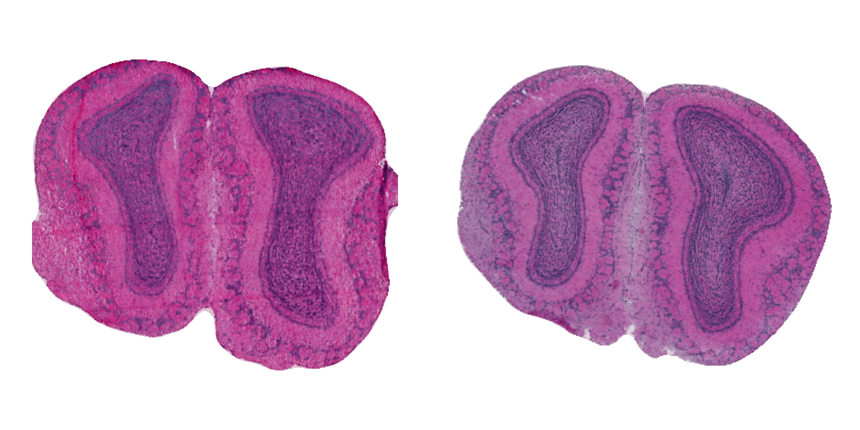
Figure 3.4: Processed H&E images
Now that we have the two tissue sections aligned, it will be much easier to compare expression patterns between them.
We can now also plot gene expression values on top of the H&E images.
col_scale <- c("darkblue", "cyan", "yellow", "red", "darkred")
FeatureOverlay(se,
               features = "Nrgn",
               sampleids = 1:2,
               ncols = 2,
               pt.size = 2.5,
               max.cutoff = "q99",
               cols = col_scale,
               add.alpha = TRUE,
               label.by = "slide_id",
               type = "processed")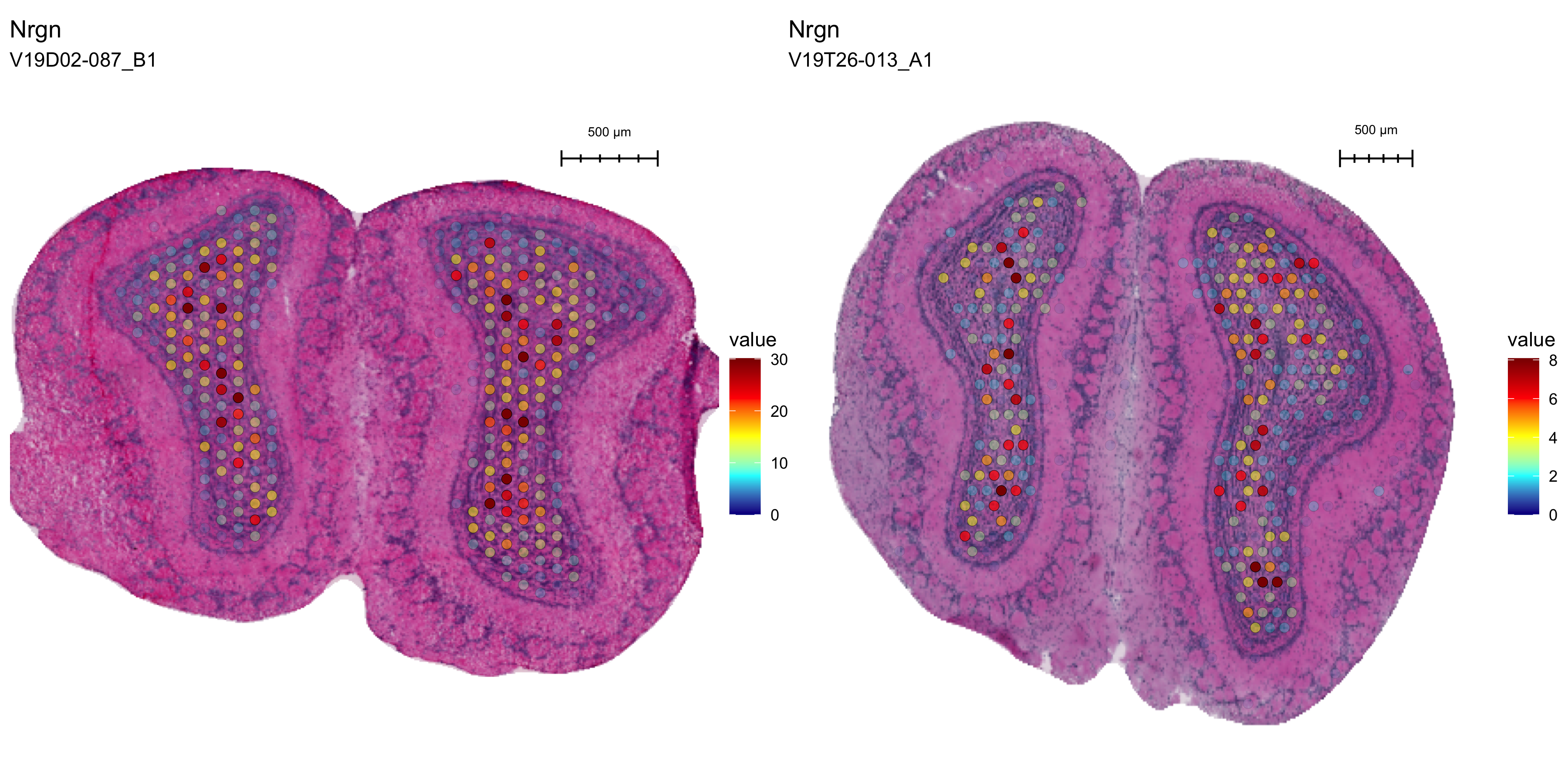
Figure 3.5: Spatial distribution of Nrgn
For the marker gene Nrgn, we can see that the gene is specifically expressed in one region of the MOB, although the counts are much higher in the first section due to the overall higher quality of the data set.
Before we move on with downstream normalization and filtering, let’s spend a few minutes on quality control and filtering.