5.2 Dimensionality reduction
We’ll start off by running a simple principal component analysis (PCA) followed by UMAP for visualization. We can color the points based on the batch to see how well the two data sets mix.
se.norm <- se.norm %>% RunPCA() %>% RunUMAP(dims = 1:30)
se.cor <- se.cor %>% RunPCA() %>% RunUMAP(dims = 1:30)
p1 <- DimPlot(se.norm, reduction = "umap", group.by = "batch", cols = col_samples) + labs(title="No correction")
p2 <- DimPlot(se.cor, reduction = "umap", group.by = "batch", cols = col_samples) + labs(title="SCT batch correction")
p1 - p2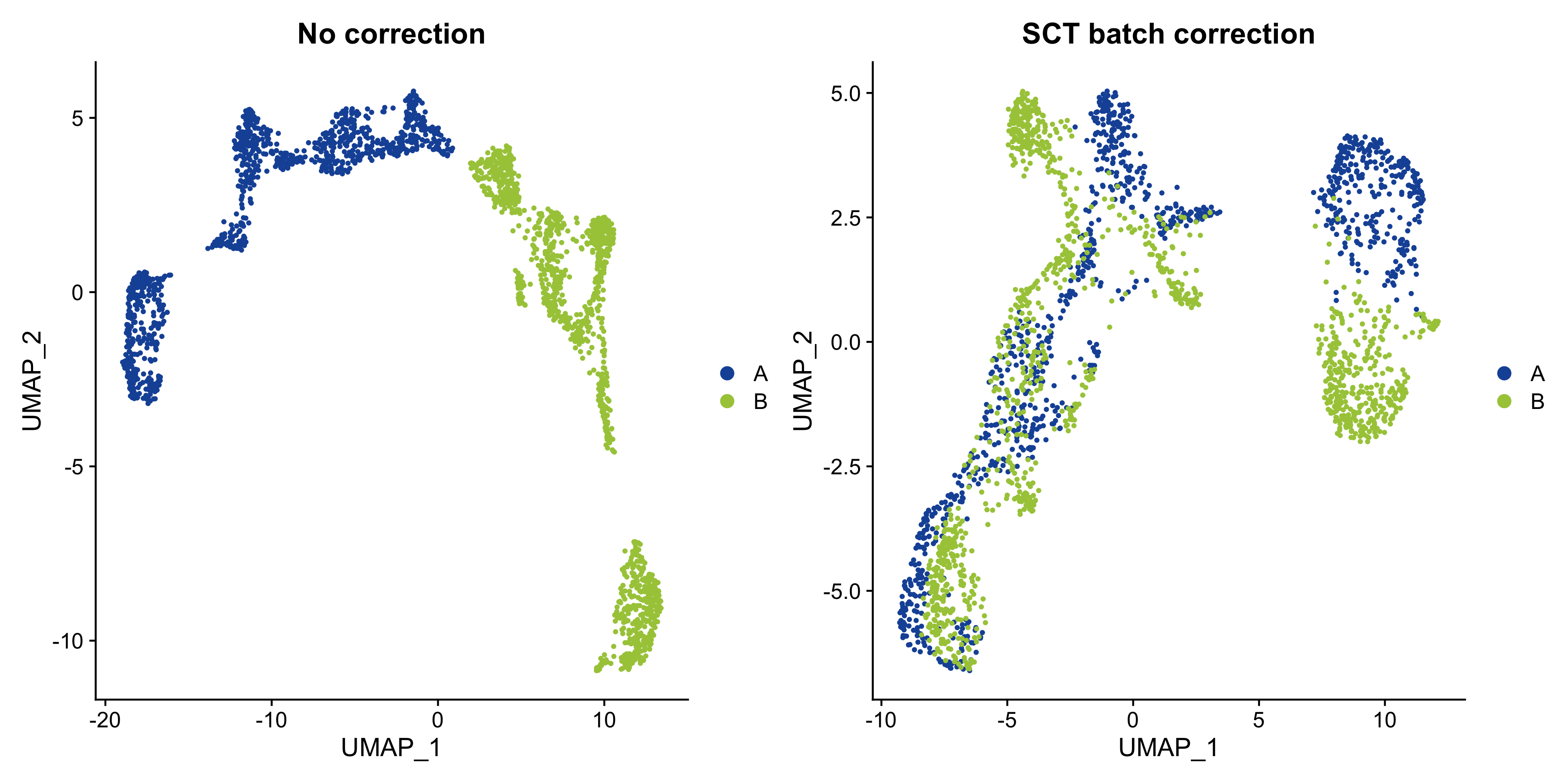
Figure 5.1: UMAP embedding of MOB data with and without batch correction.
Looks like adding the batch correction in SCTransform helped quite a lot to mitigate the batch effect, although we still see that the two tissue sections separate in the UMAP embedding.