2.2 Import data
It’s time to import the data into R using the function InputFromTable and providing our infoTable to point at where the data is located. In addition, we can perform some initial quality filtering of the data, for instance removing spots and genes with very low UMI counts.
se <- InputFromTable(infotable = infoTable,
                     minSpotsPerGene = 5,
                     minUMICountsPerGene = 100,
                     minUMICountsPerSpot = 500,
                     platform =  "Visium",
                     verbose = TRUE)
## Using spotfiles to remove spots outside of tissue
## Loading ../data/V19D02-087_B1/filtered_feature_bc_matrix.h5 count matrix from a 'Visium' experiment
## Loading ../data/V19T26-013_A1/filtered_feature_bc_matrix.h5 count matrix from a 'Visium' experiment
##
## ------------- Filtering (not including images based filtering) --------------
## Spots removed: 23
## Genes removed: 37684
## Saving capture area ranges to Staffli object
## After filtering the dimensions of the experiment is: [11025 genes, 2345 spots]To check everything looks ok, we can do a few plots of the data.
col_samples <- c("#1954A6", "#A7C947")
VlnPlot(se, features = c("nFeature_RNA", "nCount_RNA"), group.by = "slide_id", cols = col_samples)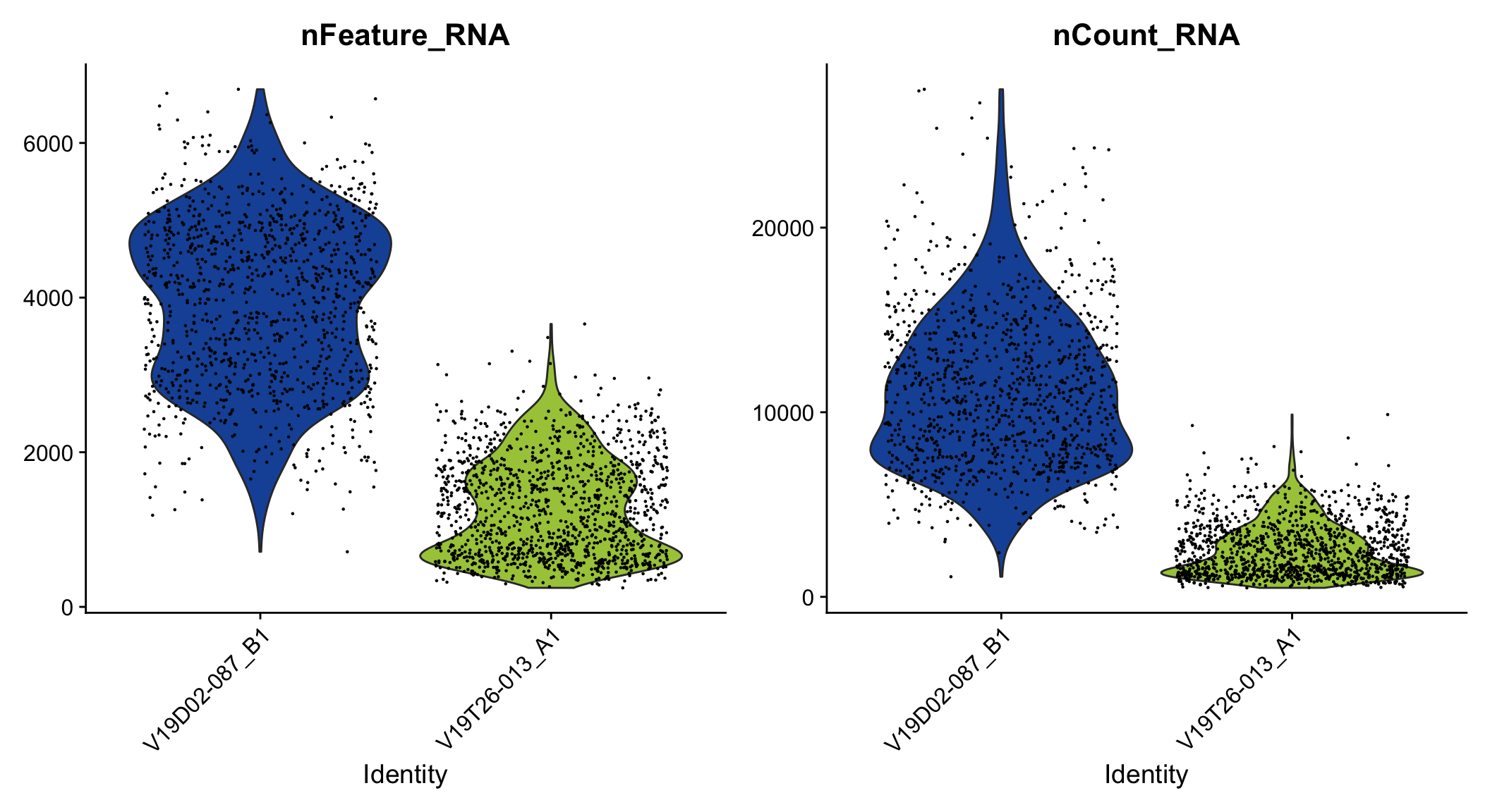
Figure 2.1: Violin plot of unique genes and UMIs.
col_scale <- c("darkblue", "cyan", "yellow", "red", "darkred")
ST.FeaturePlot(se, features = c("nFeature_RNA"), cols = col_scale, ncol = 2, pt.size = 1.8, label.by = "slide_id")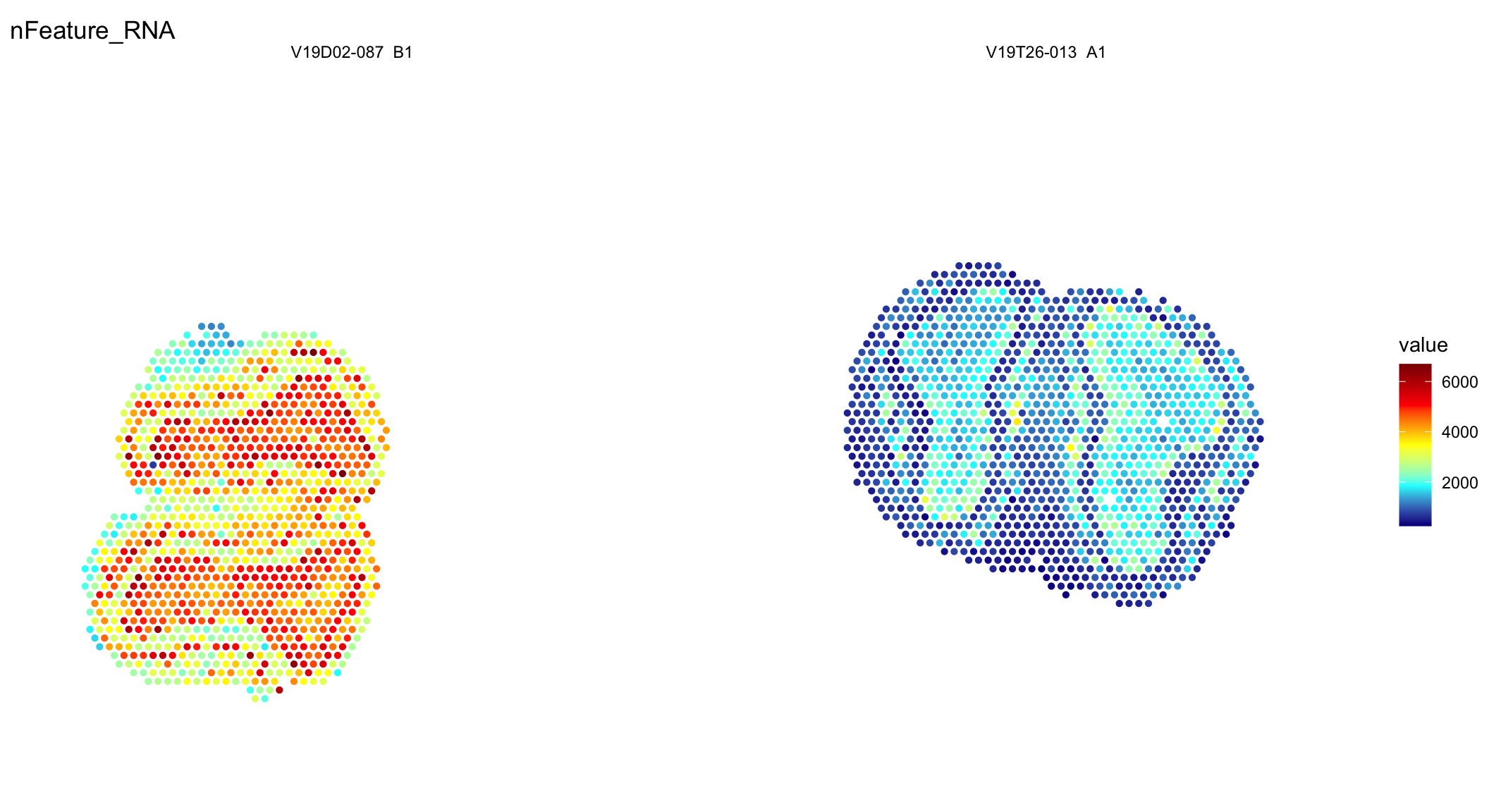
Figure 2.2: Spatial distribution of unique genes and UMIs.
Seems like the data is in! From these plots you can clearly see that one of the tissues is of lower quality and thus have fewer unique genes (nFeature_RNA) and UMIs (nCount_RNA).
We can also easily plot the spatial locations of a few selected genes. The MOB consists of multiple layers, including the glomerular layer, the external plexiform layer, the mitral cell layer, the internal plexiform layer, and the granule cell layer. A few known gene markers for a couple of these layers are Cdhr1 and Camk2a, so let’s plot and see how it looks.
col_scale <- viridis::magma(n = 11, direction = -1)
p1 <- ST.FeaturePlot(se, features = c("Cdhr1", "Camk2a"), indices = 1, max.cutoff = 10, ncol = 1, grid.ncol = 1, cols = col_scale, label.by = "slide_id", show.sb = FALSE)
p2 <- ST.FeaturePlot(se, features = c("Cdhr1", "Camk2a"), indices = 2, max.cutoff = 3, ncol = 1, grid.ncol = 1, cols = col_scale, label.by = "slide_id", show.sb = FALSE)
p1 - p2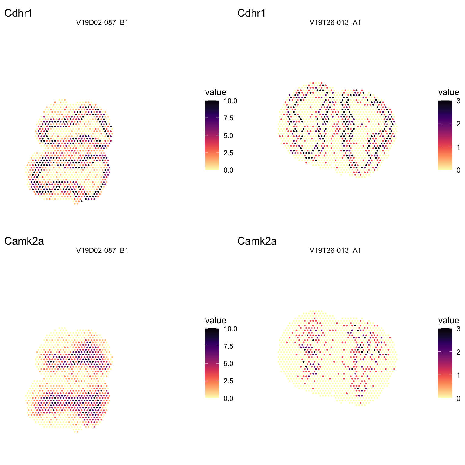
Figure 2.3: Spatial distribution of marker genes.
As one can see, the sample of poorer quality is also more sparse in its gene expression of these marker genes. To address this issue and to be able to analyze these two sections together we need to proceed with the next steps of the analysis. But first of all it can be good to perform some more quality control and filter the data further.